What is Data handling?
Data handling is referred to the procedure done to organize the information provided in order to perform mathematical operations on them.
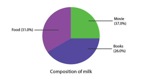
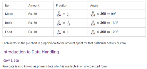
Pie Charts
A pie chart shows the relationship between a whole circle and its parts. The circle is divided into sectors. The size of each sector is proportional to the information it represents. Pie charts are also known as circle graphs.

Creating Different Pie Charts
For creating a pie chart the following steps needs to be followed:
- For each list of item or activity calculate the fraction or part which it represents.
- Convert each fraction into degrees by multiplying it with 360∘.
- Draw a circle and divide it into sectors. The central angle of each sector is equal to the fraction of 360∘ as calculated above.
Organisation of Raw Data
Raw data is unorganised. To draw meaningful inferences we organise data. There are various ways in which we can organise data. For example, we can organise raw data using Frequency distribution table, Bar graphs etc.
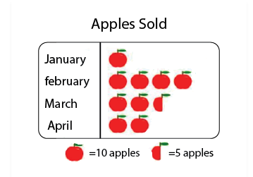
Pictographs
A pictograph is the pictorial representation of data using symbols.
For example, If 10 Apples were sold in January, 40 were sold in February, 25 were sold in March, and 20 were sold in April. We can represent the given data as a pictograph as given below:
Scale Factor
The scale factor is the ratio of the length of a side of one figure to the length of the corresponding side of the other figure. The scale factor is used in making maps. The scale of a map is the ratio of a distance on the map to the corresponding distance on the ground.
Bar Graphs
A bar graph is a representation of data using a rectangular bars that are having heights that are proportional to the values that are represented by them.
For example, the bar graph below shows the sale of cars of various brands in the month of April:
Multiple Bar Graphs
Multiple bar graphs is a bar graph which is used for comparing more than one kind of information.
Example:

The above figure is a double bar graph. It shows the number of cup of coffees sold in cafes and canteens for the months January, February, March, April and May, June and July.
Grouped Data
Frequency
Frequency is the number of times that a particular observation/event occurs.
Grouped Frequency Distribution
In a grouped frequency distribution a large amount of raw data is represented by making groups or class intervals and obtain a frequency distribution of the number of observations falling in each group.
The marks scored(out of 100) by the students of class 10th are given below:
93,98,87,65,75,77,67,88,67,97,72,73,75,90.
The above data can be represented as a frequency distribution table as:
| Marks | Frequency |
| 60-70 | 3 |
| 70-80 | 5 |
| 80-90 | 2 |
| 90-100 | 4 |
Here, 60-70, 70-80, 80-90, 90-100 are the class intervals.
In the class interval 60-70, 60 is the lower limit and 70 is the upper limit.
Class width or size = upper limit – lower limit
Note:
- The value equal to the upper limit is not included in that class interval. It is included in the next higher class interval. For example, here in the case of 90, it is not included in the class interval 80-90, it is included in the class interval 90-100.
Tally Marks
Tally marks are used to represent and count data. In tally marks, one vertical line is made for each count for the first four numbers and the fifth number is represented by a diagonal line across the previous four. The table below shows the tally marks for the numbers 1 to 10.

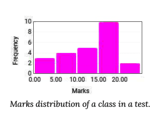
Histogram
A Histogram is a type of bar diagram, where:
- The horizontal axis represent the class intervals.
- The frequency of the class interval is represented by the height of the bars.
- Since there is no gap between the class intervals, there is no gap between the bars.
- Below is the Histogram representing the distribution of marks scored out of 20 by 24 students.
Equally Likely Outcomes
Random Experiment
A random experiment is an experiment for which the outcome cannot be predicted with certainty. Example: Rolling a dice.
Experiment and Outcomes
An Experiment is any procedure that can be infinitely repeated and has a well-defined set of possible outcomes, known as the sample space.
Each outcome of an experiment or a collection of outcomes make an event.
For example, rolling of a die is an experiment. Getting 1, 2, 3, or getting even numbers when a die is rolled is an event.
Equally Likely Outcomes
Equally likely outcomes are those which have the same chance of occurring.
Example: Tossing a coin – the probability of getting a head and probability of getting a tail is equal.
